Sometimes a quote or poem is just so beautiful that it stands on it’s own. No need for companion illustrations or more explanation—just purposeful design is needed to enhance it meaning, letting the words speak for themselves. This can be accomplished with different sizes, colors, styles, placement, or a combination of these.
PURPOSE DRIVEN
simple calligraphic quotes


Prayer for Jackson
a grandmother's prayer
2018 | Private Commission
As a special gift for her grandson, Melodie wanted to have a framed calligraphic piece of a letter she wrote for him on the day he was christened. Because she had already picked a frame without a mat, we decided to use a watercolor gold instead of true gilding. This ensured that the piece would not stick to the glass, if he ever decided to change frames.
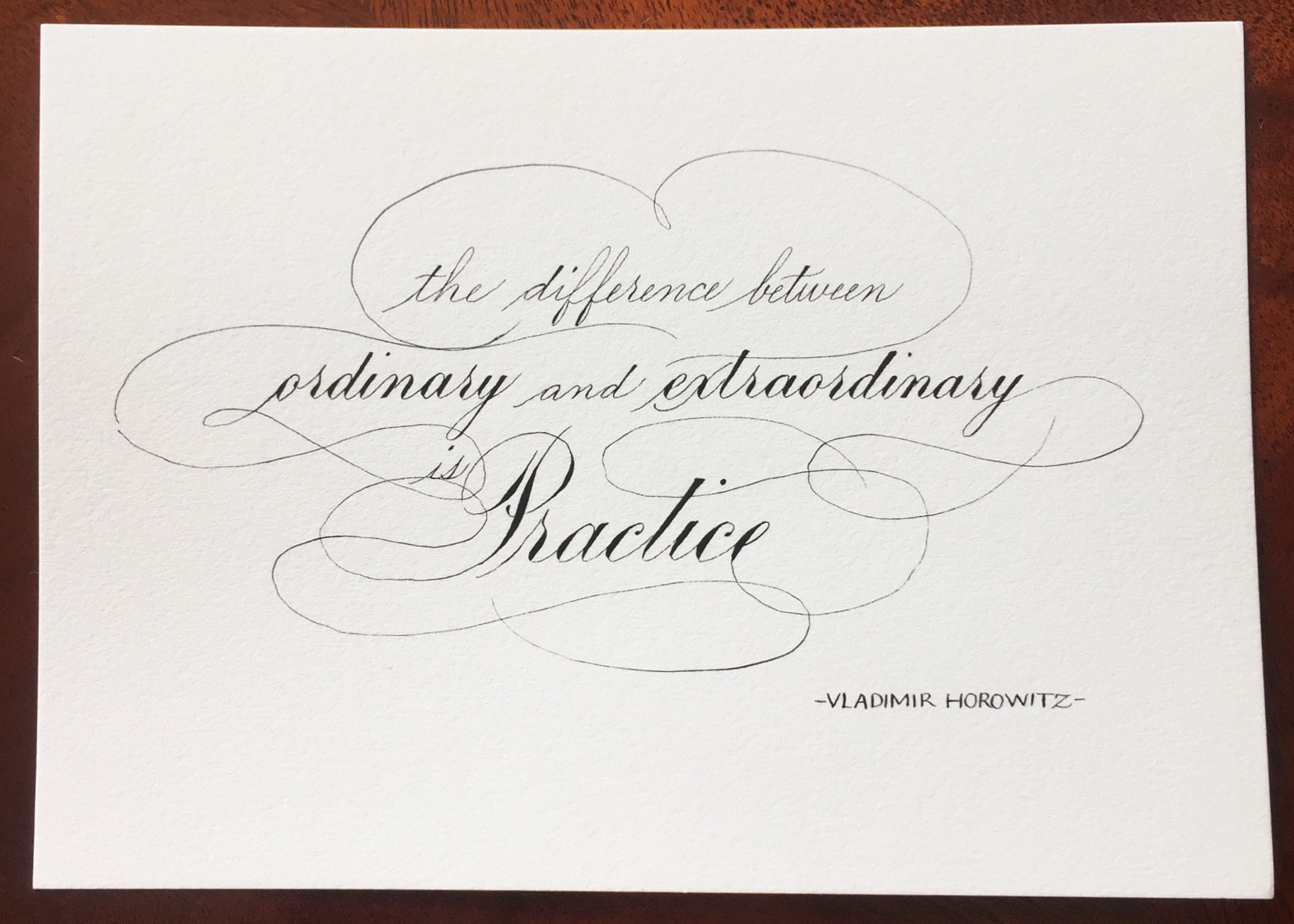
Extra—ordinary
a Vladimir Horowitz quote
2017 | Private Commission
Katherine sent me this quote her mother had always found inspiring. It meant so much to her that she wanted an art piece with it to hang in beside a personal black and white photo.
This quote has great rhythm to it. I wanted to combine delicate Spencerian Script with the bolder Engrosser’s Script to emphasis that rhythm as well as calling attention to the important parts of the quote. When it is the words and their meaning that are important in a piece, the calligraphy should not distract from them, but rather enhance them.

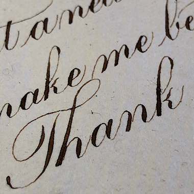
I'm Yours
song lyrics by Russell Dickerson
2018 | Private Commission
I love writing on handmade paper. It’s textured and soft, and just a joy to write on. The lux look just pairs so beautifully with the walnut ink.
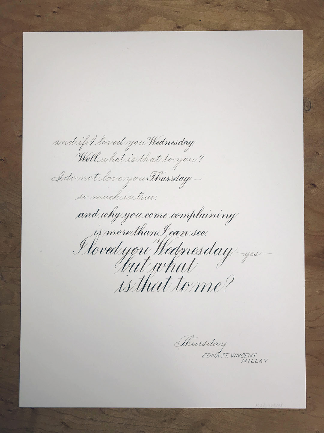
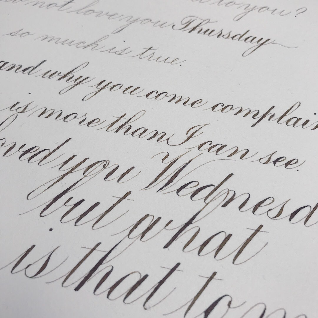
Thursday
an Edna St. Vincent Millay poem
2017 | Personal Project
Edna St. Vincent Millay always seems like she is writing today not the early 20th century. This poem is a break-up with a previous lover. I imagine it as an argument where she starts of letting him down sweetly, but he won’t take no as an answer and she has to make herself more emphatic and louder to be heard.
To show this visually within the calligraphy, I started with a simple Spencerian script with emphasized words in the same-sized, but bolder Engrosser’s script. As the conversation gets more intense, the baseline stays consistent. The words, however, get bolder and and larger until they are running into each other and overlapping, trying to take up as much space as possible to be heard visually.
Looking for something similar?
Contact me via email and we can develop a unique project together.