A primer of calligraphy jargon
the calligrapher's vocabulary defined
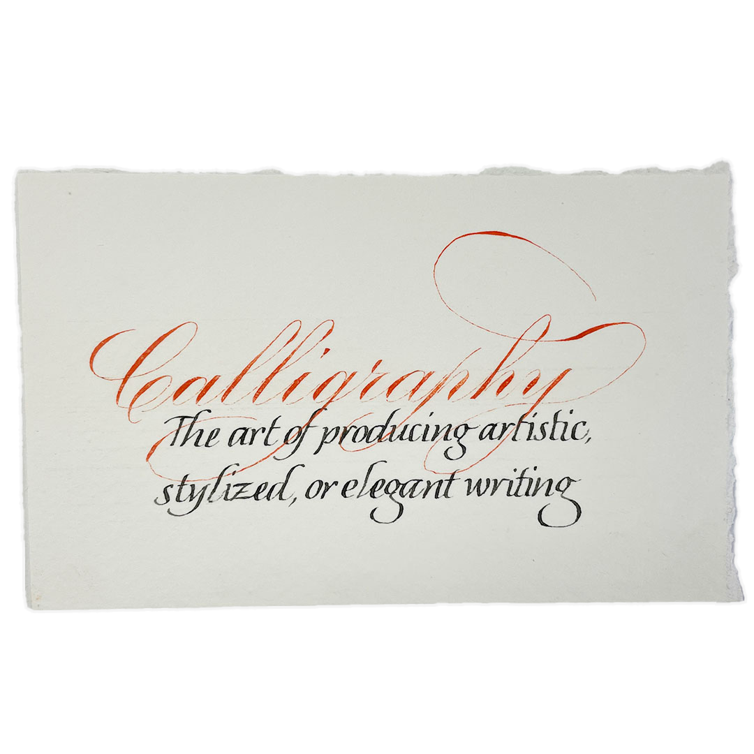
As in any craft or job, calligraphers have their own jargon. When talking to friends or clients, we often forget that our everyday vocabulary is jargon to others. This can lead to confusion and miscommunication.
Below, I have listed some of the most commonly misunderstood calligraphy terms, and defined them as used by most contemporary calligraphers. Many of the terms have slightly different definitions if you are talking to a historian, typographer, or sign-painter. This list is not meant to shame anyone for not knowing these terms. But rather to help everyone communicate better—whether commissioning work form a calligrapher, or just wanting to understand their Instagram better.
If you are a calligrapher, I hope this list helps you think about how you can communicate better to your friends, clients, and followers.

Lets start with some of the big terms
Calligraphy: Artful writing—drawn and filled letters are often removed from this category
Lettering or Hand lettering: A broader term that includes any handmade letters, no matter tool, style, technique, or medium.
Calligrapher: someone who practices the art of calligraphy, usually working on paper or parchment (prepared animal skin)
Manuscript: A hand-written book (though sometimes refers to a single page or sheet). Never printed.
Monogram: decorative single letter, or several artfully combined letters—often initials.
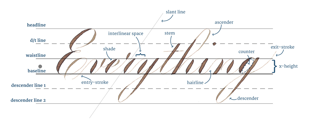
Upper- and Lowercase are a printing term (the case you keep your letters in). Sometimes calligraphers forget to use the common terms and revert to our training.
Majuscule: aka Capital letter. Majuscule & Capital letters both refer to the same thing.
Minuscule: literally small letters, but refers to lowercase letters.
Lettering styles
Script: Can mean “any style of writing”, but commonly used to mean a style where letters are connected, i.e. cursive
Hand: Has a couple of meanings, but usually is used to describe any style of writing where the letters are not connected.
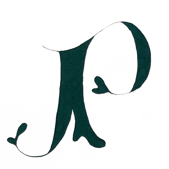
Versals: Drawn & filled letters instead of straight written letters—often in the style of Medieval titling.
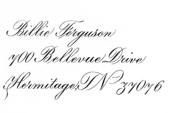
Copperplate: Usually refers to any style of writing that is written with a pointed pen, such as English Roundhand, Engrosser’s Script, & Modern Copperplate.
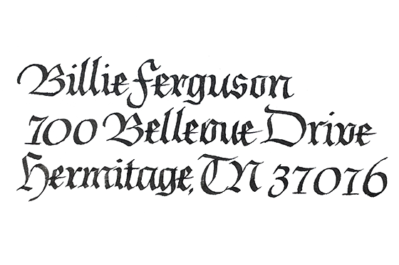
Blackletter: Family of Germanic-styled lettering, characterized by closely spaced dark strokes. Styles include Texture, Bastarda, & Fraktur. Old English (Style often used on newspaper names) is not technically Blackletter, but will often get included as short-hand.
Bookhand: a style of writing that focuses on legibility. Many styles can become a bookhand by simplifying the letterforms. Common bookhands include Italic, Foundational, Uncial.
Layout & Decorations
Margins: the white space around artwork & writing. Usually a minimum of an inch all around but often much more.
Borders: decorations (often repeating) encircling artwork & writing. Art pieces with borders, will generally have smaller margins.
Engrossing: Decoration of a formal document. This term can be used to describe any legal document, but is most often used to describe the style of documents from the late 19th and early 20th century.
Flourishes: gestural decorations extended from the letterform
Filigree: fine decorative work, usually made up of delicate thin lines, circles, and dots. Rarely touches letterform.
Illumination: Generally refers to work that is done in the style of a Medieval manuscript that has been decorated with gold and delicate paintings. Though technically “illumination” just refers to just the applied gold, it often includes the filigree and decorative paintings that surround the gold.
Gilding: The gold that is applied to a manuscript. Whether gold leaf (very thin sheets of gold) or gold paint (ground gold in paint form). This generally does not refer to “gold” paint.
Size: The glue used to apply gold leaf. May be flat & smooth, or raised from page
Have I forgotten some terms that need definition? Have a used terms that still need more clarification? Let me know and I will add them!
 Katie Leavens
