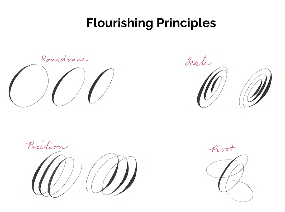
Flourishing as emphasis
using design principles in your flourishes
I began teaching last year. I have found that not only do I enjoy sharing my love of letters, I learn a lot too. Not only have my letters and lines become more sure, but each class has has also led to a breakthrough moment, or an Ah Ha moment. Sometimes these come while studying to teach, or setting up the class. But more often than not these Ah Ha moments come while actively teaching a concept to students.
This summer, I taught a flourishing class. The first class started students with the principles of design and how to apply those principles to flourishes. During the last class, I was doing some on-the-fly flourished writing for the students. While I do this, I try to explain what I’m thinking—why I’m doing what I’m doing.
Often students of flourishing lament that they just don’t know where to begin flourishing, or when to stop. As a calligrapher with a background in design, I think of flourishes as tools to emphasize what’s important.
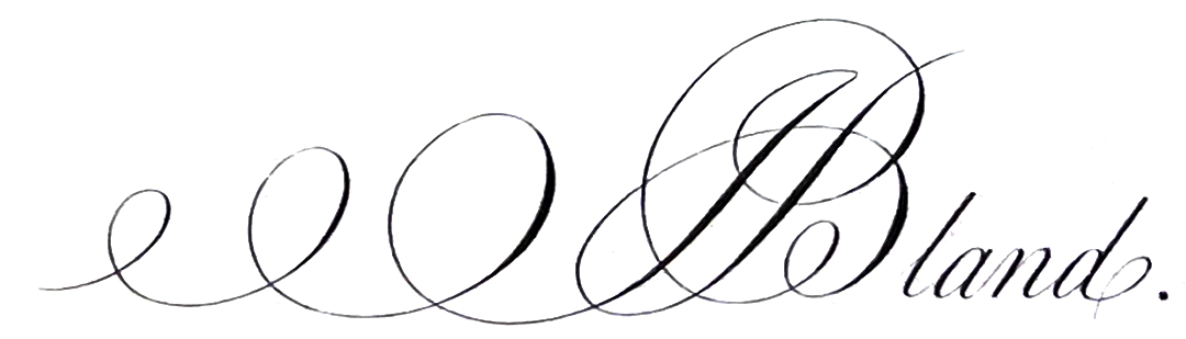
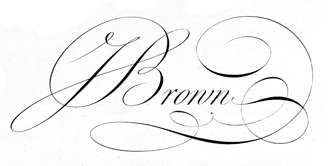
Often calligraphers flourish the left appendages of the majuscule or the end of a word. But are those really areas that should be emphasized, or are we just filling space? If we use the principle of emphasizing importance, what should we be flourishing? What’s the most important part of a word? Generally, the first letter (usually a majuscule). What’s the most important part of that majuscule? The backbone, the stem, the line of universal beauty. In that case, why do we not flourish it in pointed pen work?
I would like to challenge calligraphers to look at their work as pieces of design, not just making pretty pieces.
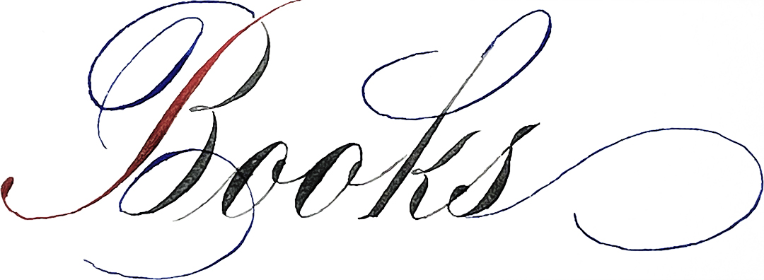
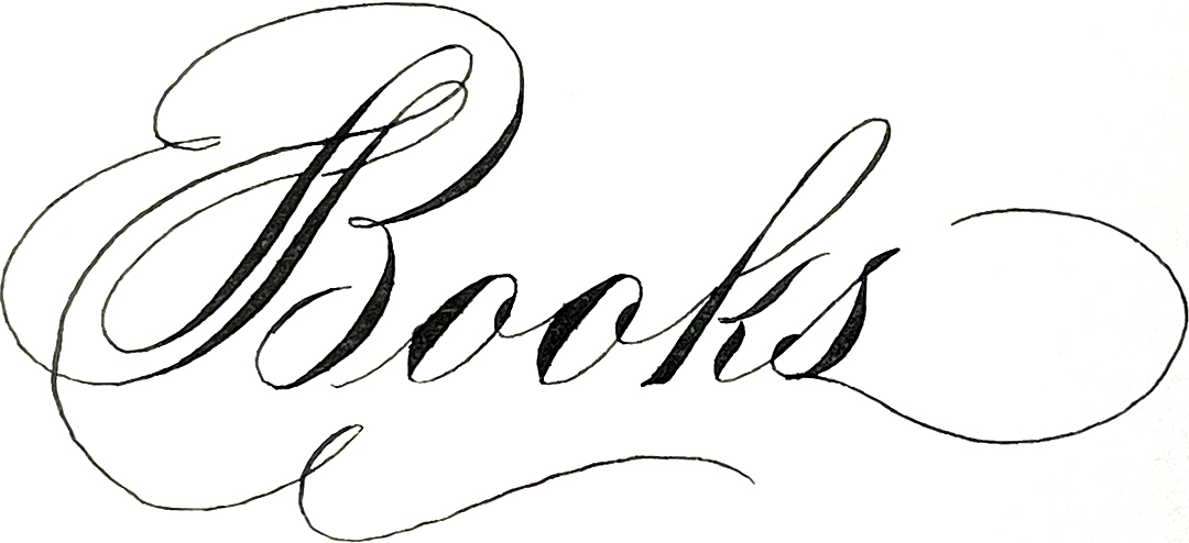
Here are a few historic examples of stem flourishing to get your creative juices flowing.